(著)山たー
手書き風グラフをmatplotlibで描きます。こんなの(Documentより)。

横軸:時間、縦軸:健康、矢印の先:好きな時にベーコンを焼けると気付いた日
使うとすれば、論文・レポート用ではなく、軽い感じの講義用でしょうか。
xkcdについて
xkcdはランダル・マンローによるウェブコミックサイトです。手書きの棒人間で描かれているのが特徴です。

『ウィキペディアな抗議者』:要出典(CITATION NEEDED)のボードを掲げている。
ウェブサイトの内容をまとめた本としてWHAT IF?が発売されています。馬鹿げた質問を真剣に考えてみるという内容です。翻訳本も発売されています(amazon)ので、ぜひ読んでみてください。
使用例1:普通のグラフ
with plt.xkcd(): で描画内容を囲めばok。plt.xkcd()を書くだけだと、直後のコマンドしかxkcd化されない。

import matplotlib.pyplot as plt
import numpy as np

# gaussian function
def gaussian_func(x, mu, sigma):
    return 1/(sigma * np.sqrt(2 * np.pi)) * np.exp( - (x - mu)**2 / (2 * sigma**2))

x = np.arange(-5, 5, 0.01)
data = gaussian_func(x, 0, 1)

with plt.xkcd():
    fig = plt.figure()
    ax = fig.add_axes((0.1, 0.2, 0.8, 0.7))
    ax.spines['right'].set_color('none')
    ax.spines['top'].set_color('none')
    plt.title("Gaussian Distribution")
    plt.plot(x, data)
    plt.savefig("gaussian.png")
統計学図鑑のグラフもこんな感じですね。
使用例2:棒グラフ
Documentより。

上:超能力についての主張
左:実験で確認された数、右:実験で否定された数
import matplotlib.pyplot as plt

with plt.xkcd():
    # Based on "The Data So Far" from XKCD by Randall Monroe
    # http://xkcd.com/373/

    fig = plt.figure()
    ax = fig.add_axes((0.1, 0.2, 0.8, 0.7))
    ax.bar([0, 1], [0, 100], 0.25)
    ax.spines['right'].set_color('none')
    ax.spines['top'].set_color('none')
    ax.xaxis.set_ticks_position('bottom')
    ax.set_xticks([0, 1])
    ax.set_xlim([-0.5, 1.5])
    ax.set_ylim([0, 110])
    ax.set_xticklabels(['CONFIRMED BY\nEXPERIMENT', 'REFUTED BY\nEXPERIMENT'])
    plt.yticks([])

    plt.title("CLAIMS OF SUPERNATURAL POWERS")

    fig.text(
        0.5, 0.05,
        '"The Data So Far" from xkcd by Randall Monroe',
        ha='center')

    plt.show()
    plt.savefig("barplot.png")
使用例3:円グラフ
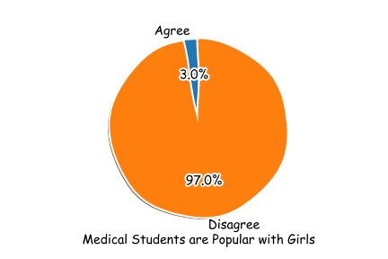
import matplotlib.pyplot as plt

labels = 'Agree', 'Disagree'
sizes = [3,97]
explode = (0,0)

with plt.xkcd():
    plt.pie(sizes, explode=explode, labels=labels, autopct='%1.1f%%',
            shadow=True, startangle=90)
    plt.axis('equal')  # Equal aspect ratio ensures that pie is drawn as a circle.
    plt.text(
        0, -1.3,
        'Medical Students are Popular with Girls',
        ha='center')

    plt.savefig("pi.png")
    plt.show()
作ってて悲しくなりました。
コメントをお書きください